Historical Exhibition, Research & Design
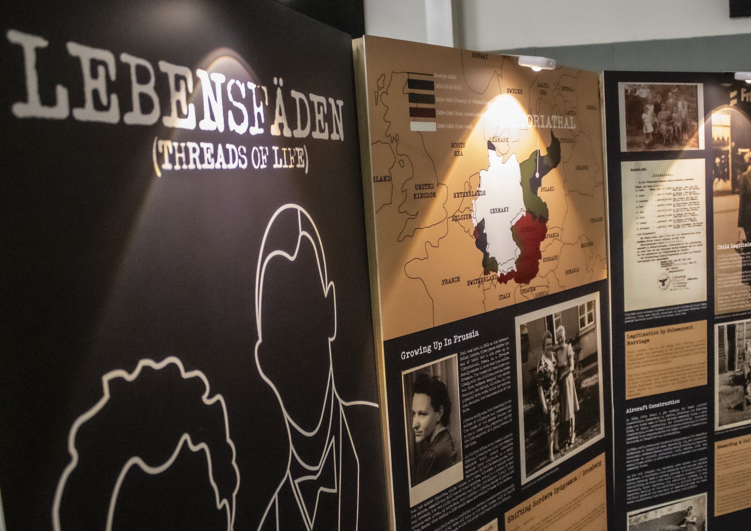
LEBENSFÄDEN
(Threads Of Life)
Gaensicke Family History
Lebensfäden is a deeply personal project based on the lives of my paternal great-grandparents, Fritz and Ruth Gänsicke (Pronounced Gan-Sick-A). Growing up, I was always intrigued by my German heritage but never thought to ask about it until it was too late. My greatest inspiration has always been my Opa, a creative through and through, who studied at the Ontario School of Art, interned under Picasso, and worked as a graphic designer, photographer, and sculptor. When I was a child, he would draw me small doodles and teach me early photo-editing tricks. His creativity and curiosity have strongly influenced my own path in design and photography.
When it came time to choose a focus for my Capstone project at Media Design School, I decided to honour my Opa by uncovering and preserving my family’s story. As I shared my family history with my peers, I noticed that people often assumed my great-grandparents had Nazi affiliations. This reaction motivated me to tell their story more widely and accurately, to explore how ordinary German families like mine lived during and after World War II, and to challenge the stereotype that all Germans were Nazi’s. My aim for this exhibition is for visitors to leave with empathy, a deeper understanding of untold history, and an appreciation for how family stories can connect the past to the present.
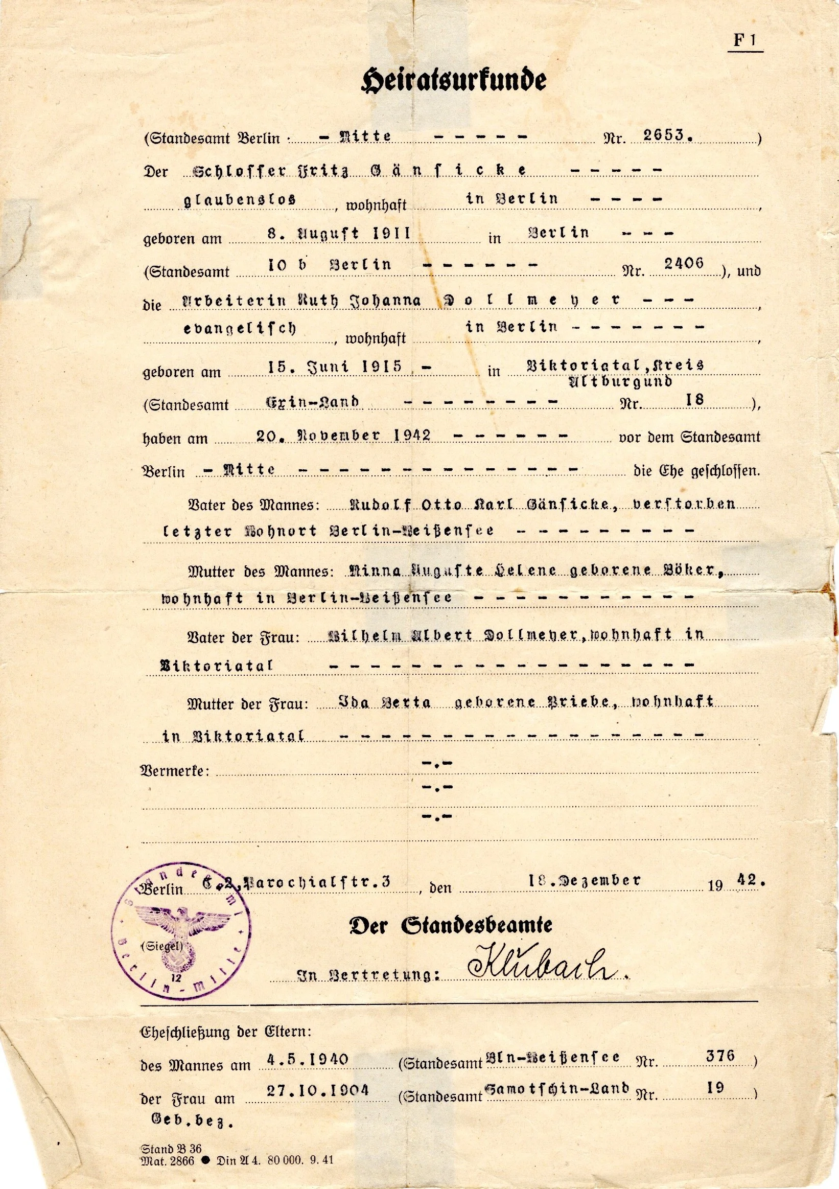
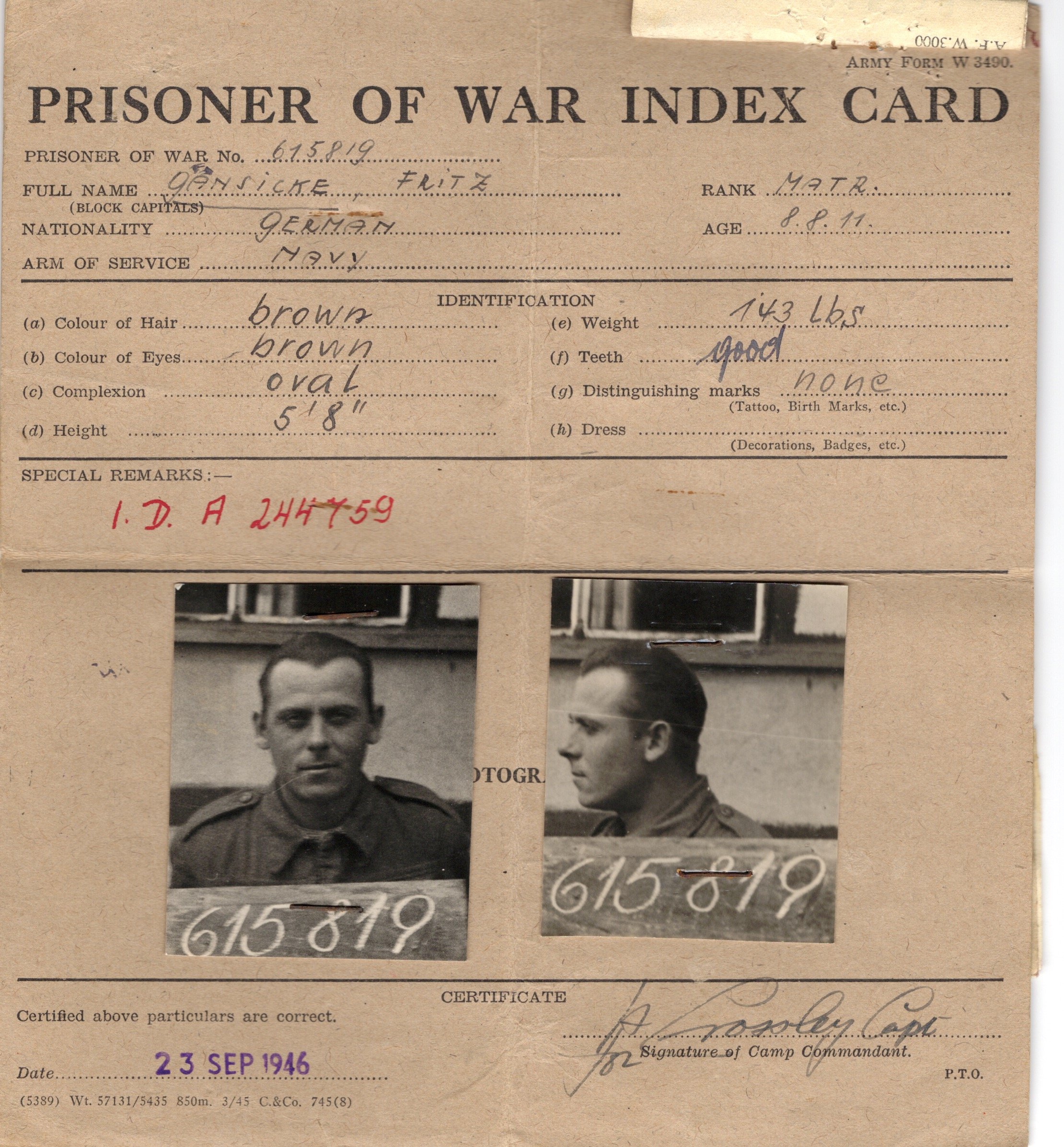
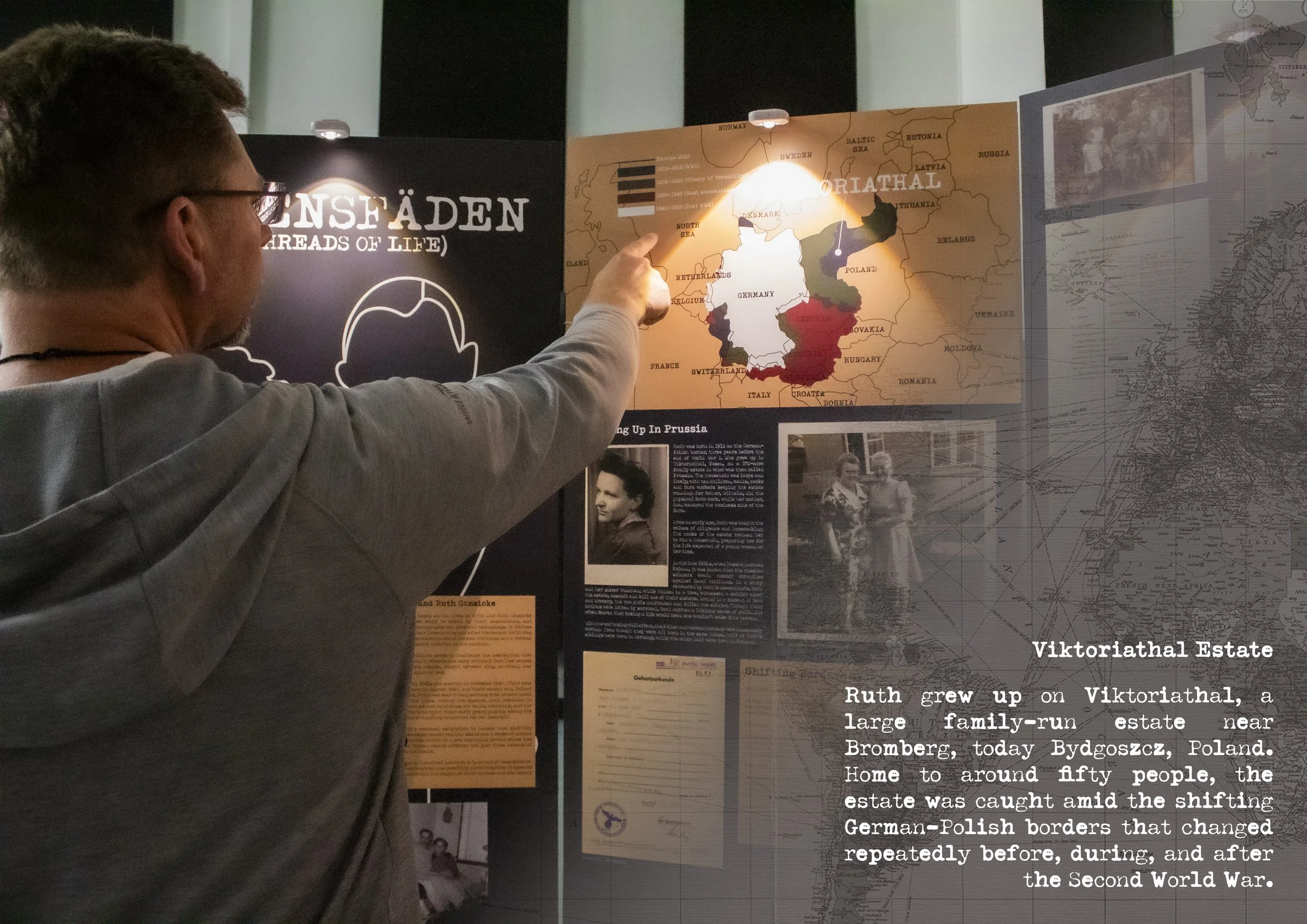
The research process was extensive and hands-on. My father had inherited a remarkable family archive spanning over a century, from 1900 to 2014, including birth and marriage certificates, military records, refugee and emigration documents, and thousands of photographs. Over the course of two months, I translated hundreds of fragile German documents using AI-assisted tools, cross-referencing each translation with multiple sources for accuracy. Another month was spent conducting contextual research and verifying stories through interviews with my father and uncles. Finding my great-grandmother Ruth’s birthplace, Viktoriathal, alone took three months of searching.
Among the materials, I discovered over a thousand negatives, around 900 of which I digitised myself, with the remainder professionally scanned. Many documents were also carefully digitised to preserve the originals and make the collection accessible for both my family and exhibition use.
For the physical exhibition, I designed eight large panels arranged in a semi-circle to symbolise the circle of life, I used this layout as it guides viewers through the exhibition, as well as providing good flow. Through documents, photographs, artefacts, and voice recordings, I guide viewers through Fritz and Ruth’s journey, revealing how ordinary Germans navigated the aftermath of war.
The visual identity of Lebensfäden draws inspiration from my great-great-grandmother Ida’s death notice, a textured cream paper bordered in black with typewritten text. I wanted my branding to reflect the 1940’s and 1950’s era. I recreated this aesthetic using the font Typeka, I chose this font because it has a real authentic typewriter look, with the imperfect print of the letters.
The colour palette combines steel blue, sepia, and cream, referencing wartime museums and historical imagery. Two complementary shades, Krieg, a deep red symbolising war, and Leben, a forest green representing life.
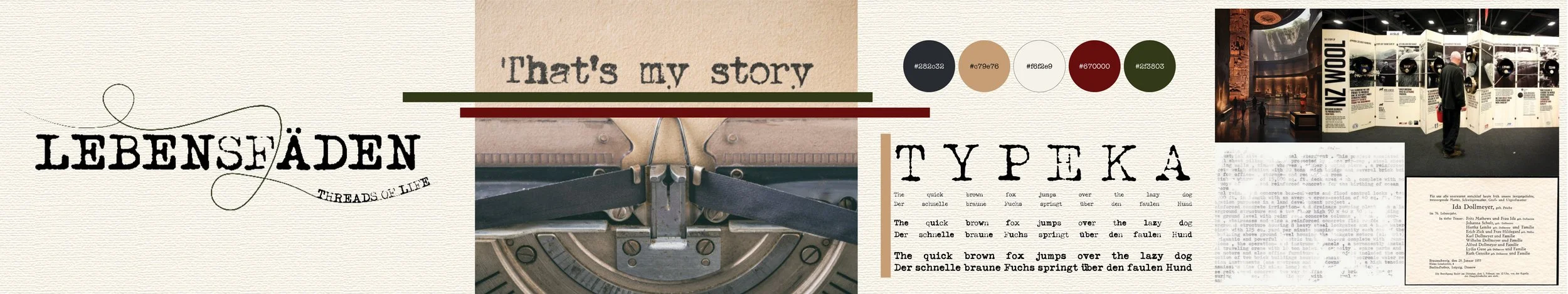
The project’s logo features a threaded line, a visual representation for lifespan, destiny and interconnection, which I felt was fitting for the project as its about Fritz and Ruth’s lifetime and how destiny brought them to where they ended up, as well as the interconnection of generations that has now led to me. This all aligns well with the meaning of Lebensfäden (Threads of Life).
Final Outcome