Branding & Promotional Material
Mauri Oho
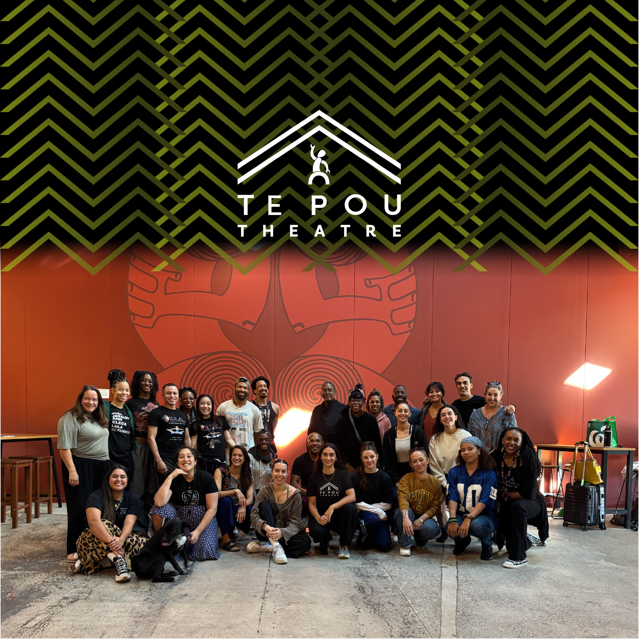
Te Pou Theatre
Group Project
In collaboration with Loretta Steyn, Noah Smith, Corey McBride & Nigel Murch
This group project focused on elevating Te Pou Theatre’s presence in the West Auckland community. We were tasked with amplifying the theatre’s brand awareness to the public so that the theatre can host more shows, events, and festivals that reflect Te Pou’s kaupapa. While also creating a cohesive brand system that would be easy for the team to use and manage in Canva. The goal was to strengthen brand recognition, engage audiences, and showcase the unique impact of Māori theatre.
To address the brief, our solution combined branding enhancements, flexible marketing templates, an interactive poster, and a website redesign. These outcomes ensured consistency across all touchpoints, simplifies content creation for the Te Pou team, and brings the theatre’s unique cultural perspective and emotional energy to life.
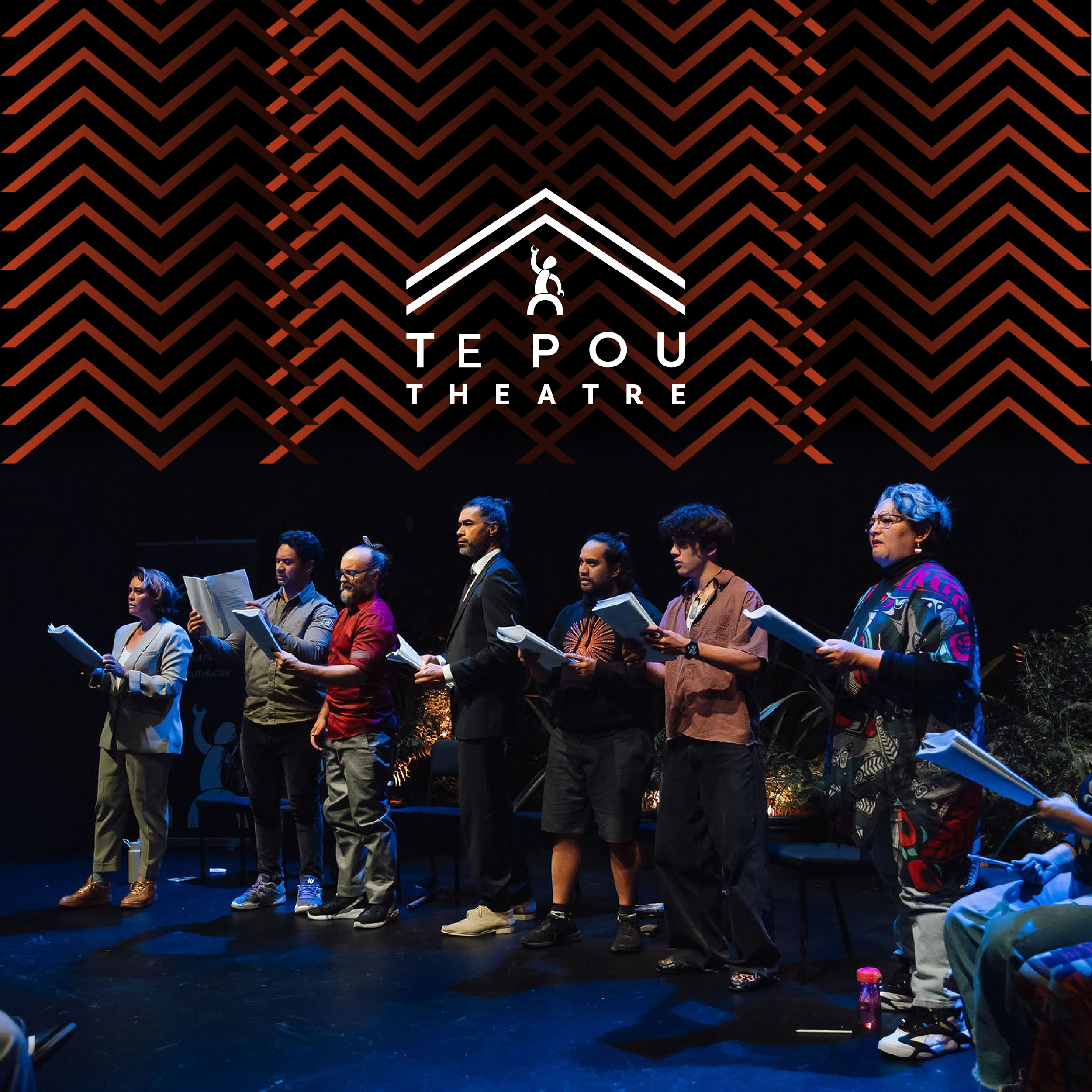
Branding & Project Inspiration
At the start of the project, we enhanced Te Pou’s existing branding to create a more dynamic and engaging visual identity. My contributions focused on elevating the colour palette and refining typography, Noah and I worked together to develop the cosmology-inspired colour references. Noah created our collection of Kao Kao patterns, and Corey brought the brand to life with subtle animations.
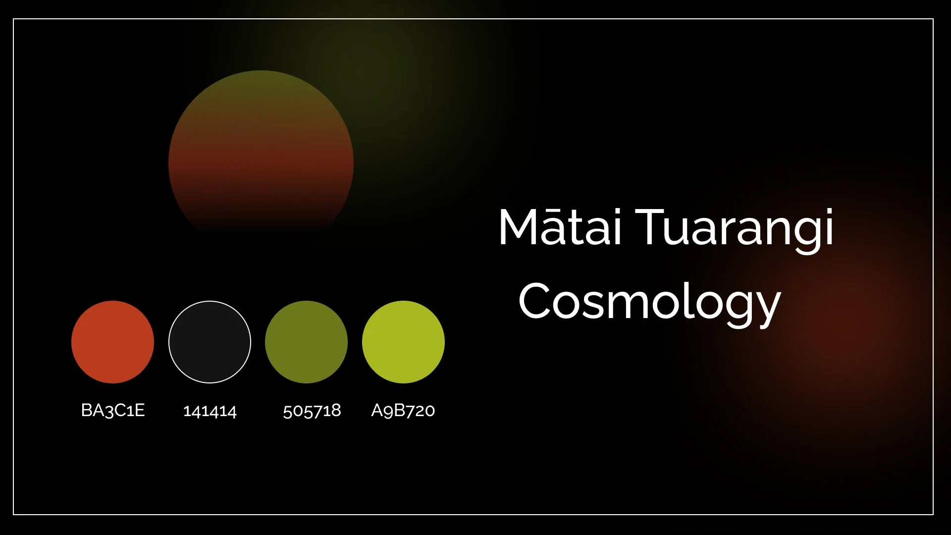
Our updated colour palette builds on the existing palette of Ochre Red and Pure Black with additional detail, emphasising cosmology and Ranginui. The gradient of whero, kakariki, and pūngao reflects the significance of whetū, Matariki, and starlight, representing inclusivity for everyone.
I refined Te Pou’s typography by introducing Lato as a complementary body text font, while retaining Raleway as the primary heading typeface. This choice ensures harmony between fonts and maintains a cohesive, professional visual identity across all branded materials.
Our design approach was guided by the Māori performance principles of Ihi, Wehi, and Wana, an idea proposed by Noah, aiming to express mauri oho—a stirring or awakening. Rather than focusing solely on appearance, our branding captures how Te Pou feels: energised, uplifted, and moved, reflecting the emotional depth of Māori theatre.


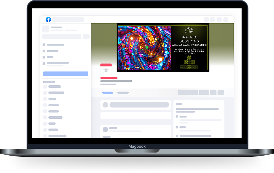
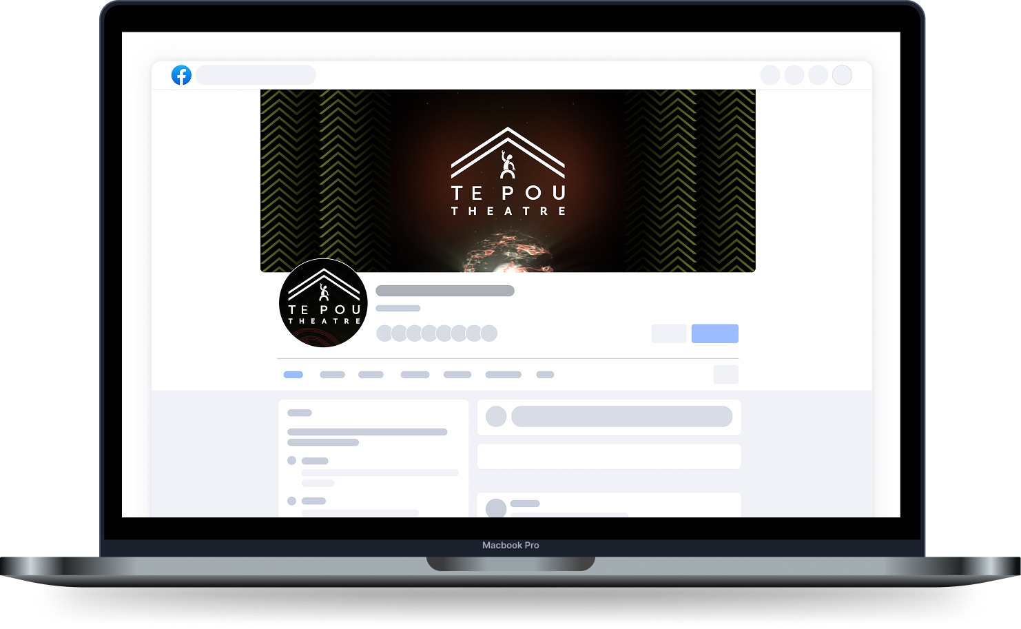
Templates & Photography
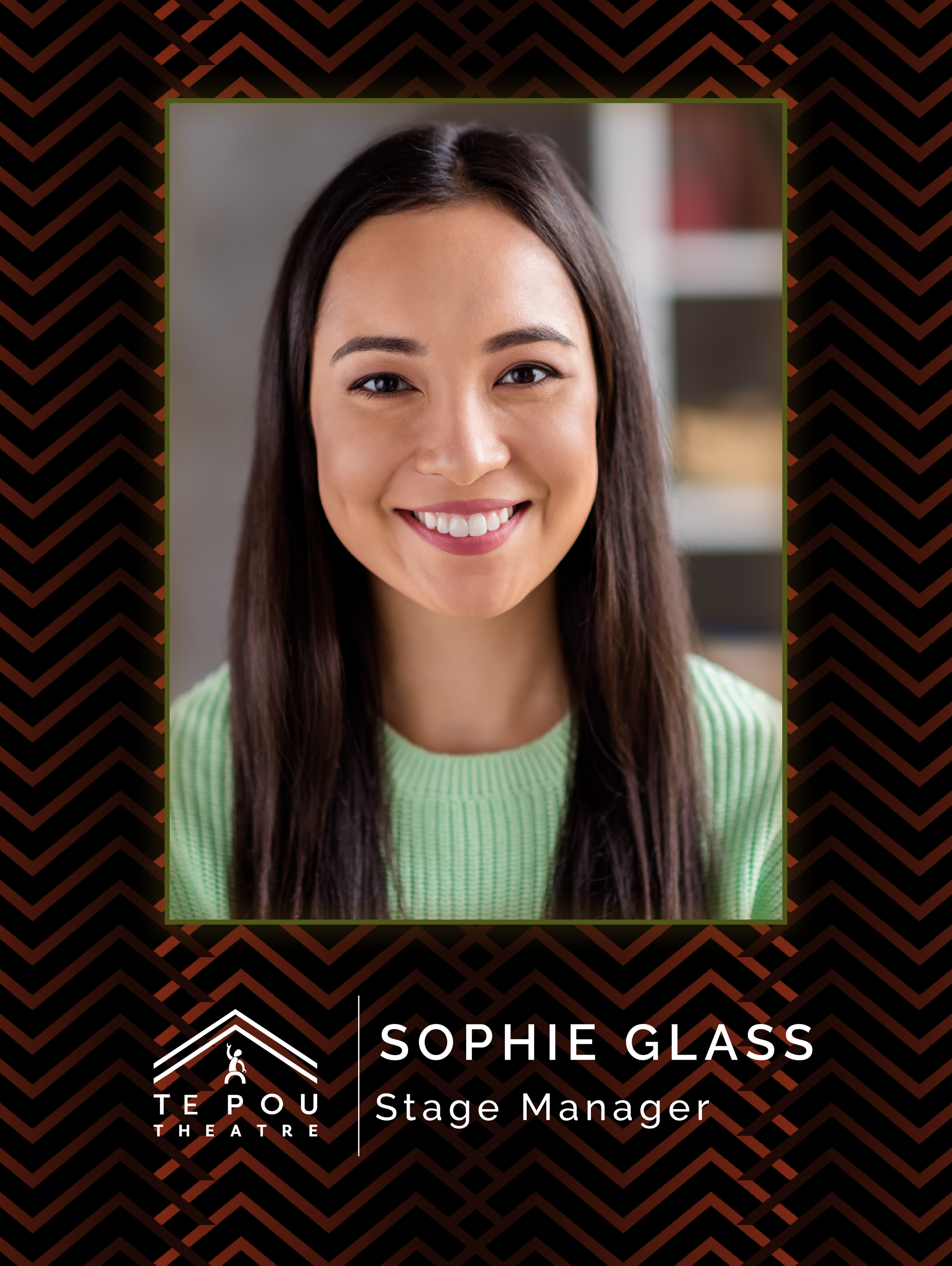
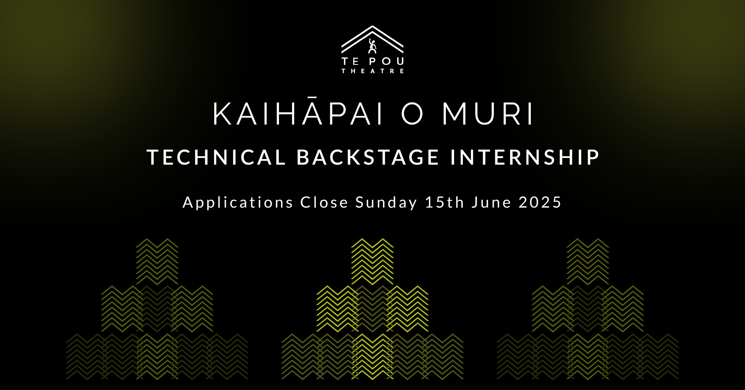
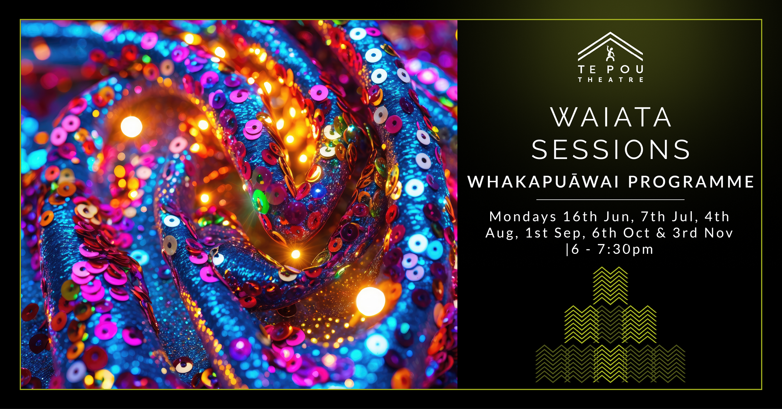
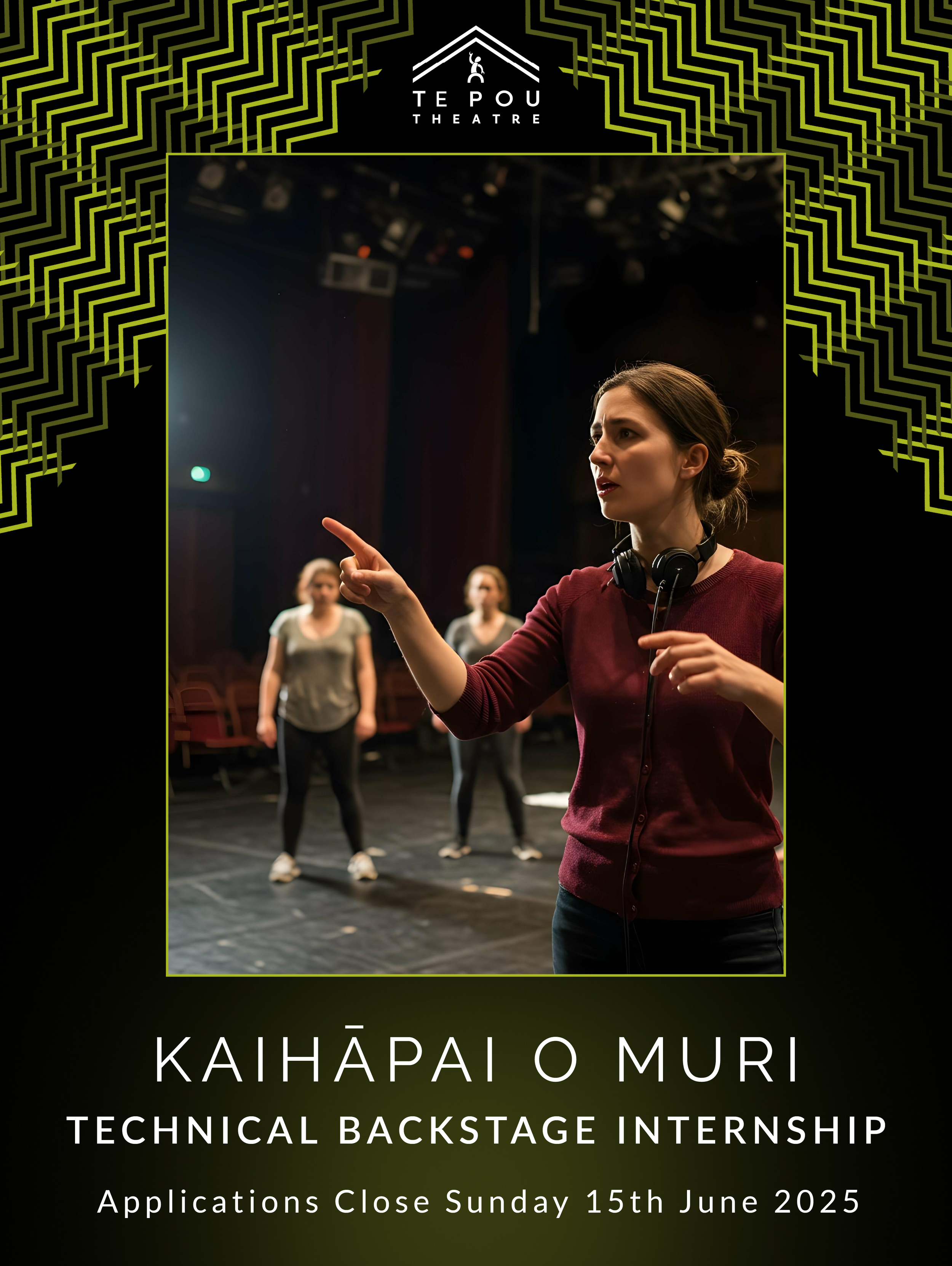
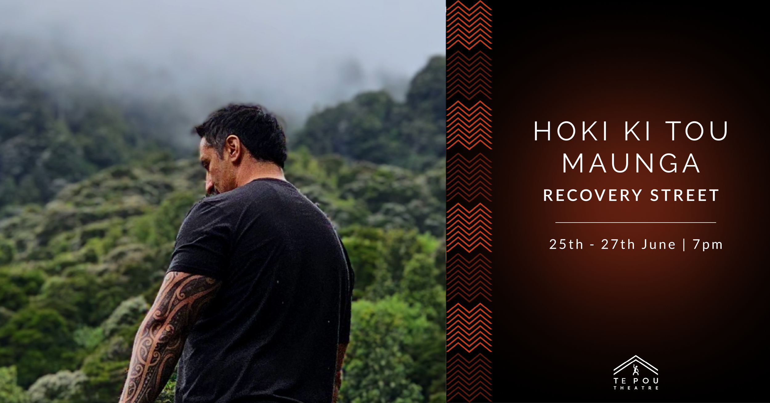
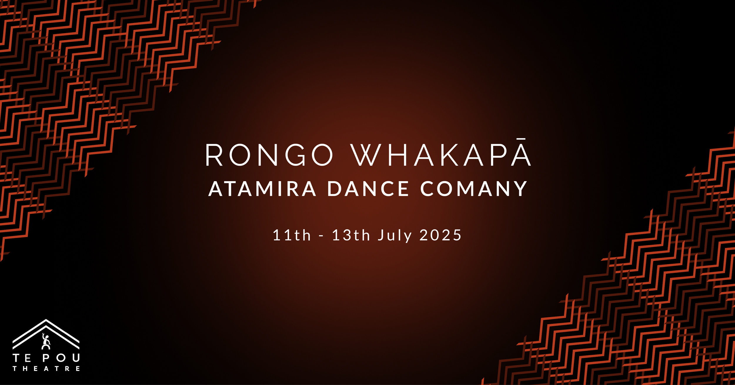
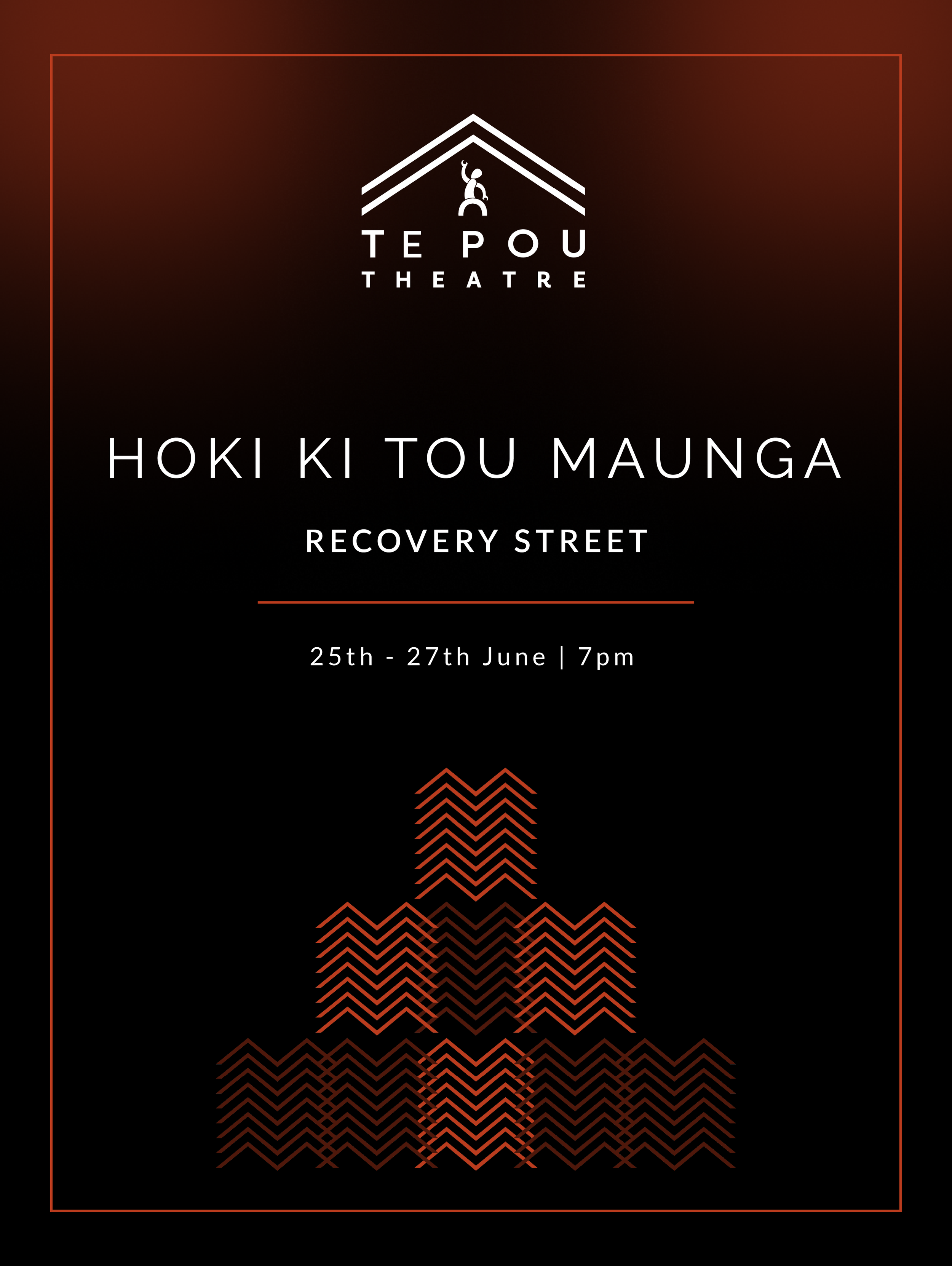
To support Te Pou’s marketing, I designed a suite of flexible marketing templates for Te Pou, focusing primarily on social media posts and banners. These templates were created to maintain a consistent visual identity across the theatre’s digital channels while being easy to edit in Canva, allowing the team to quickly produce professional, on-brand content. Loretta worked on the poster templates, complementing the overall system. We both ensured that all marketing materials were cohesive and adaptable.
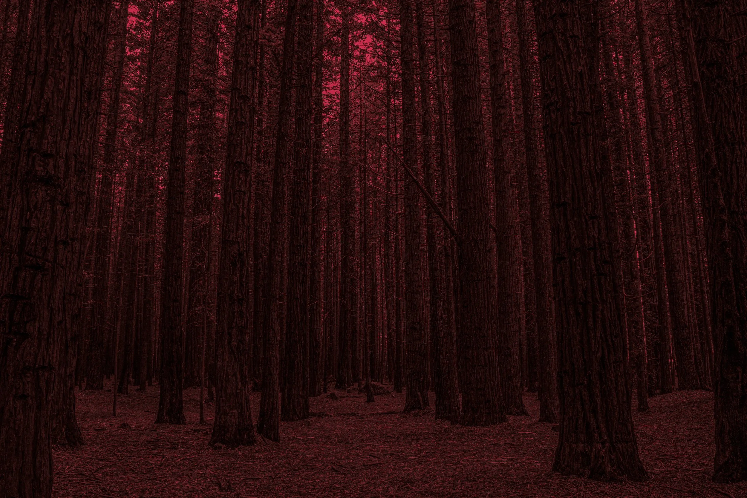
I was also tasked with taking a series of images to use within our collateral. Early in the project, we explored several locations for photoshoots to inspire visual collateral and motion visuals for Te Pou. Otuataua Stonefields was chosen for its connection to the Battle of Te Ranga and drew inspiration from Ria Hall’s music video, offering strong potential for dramatic motion visuals. The Redwoods at Whakarewarewa were selected for their ties to local Iwi and their embodiment of the values Manaakitanga and Kaitiakitanga, with a striking combination of Californian Redwoods and native New Zealand bush. Lake Tikitapu (Blue Lake) was highlighted for its vibrant blue waters, surrounding native bush, and Māori cultural significance, linked to the story of the sacred Tikitapu necklace.
While these photos were not used in the final project due to a change of direction, the research and shoots helped shape our understanding of how landscape, culture, and storytelling could influence Te Pou’s visual identity. The photographs were colour graded to integrate well within Te Pou Theatre’s branding.
Final Outcome