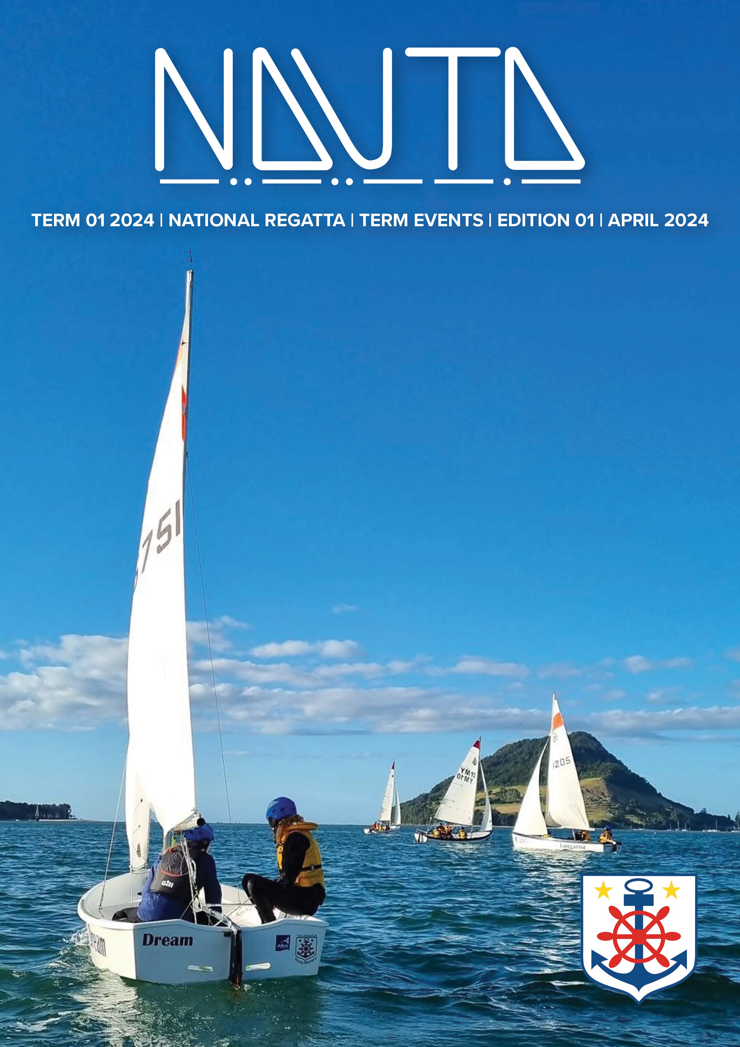
Publication & Branding
NAUTA
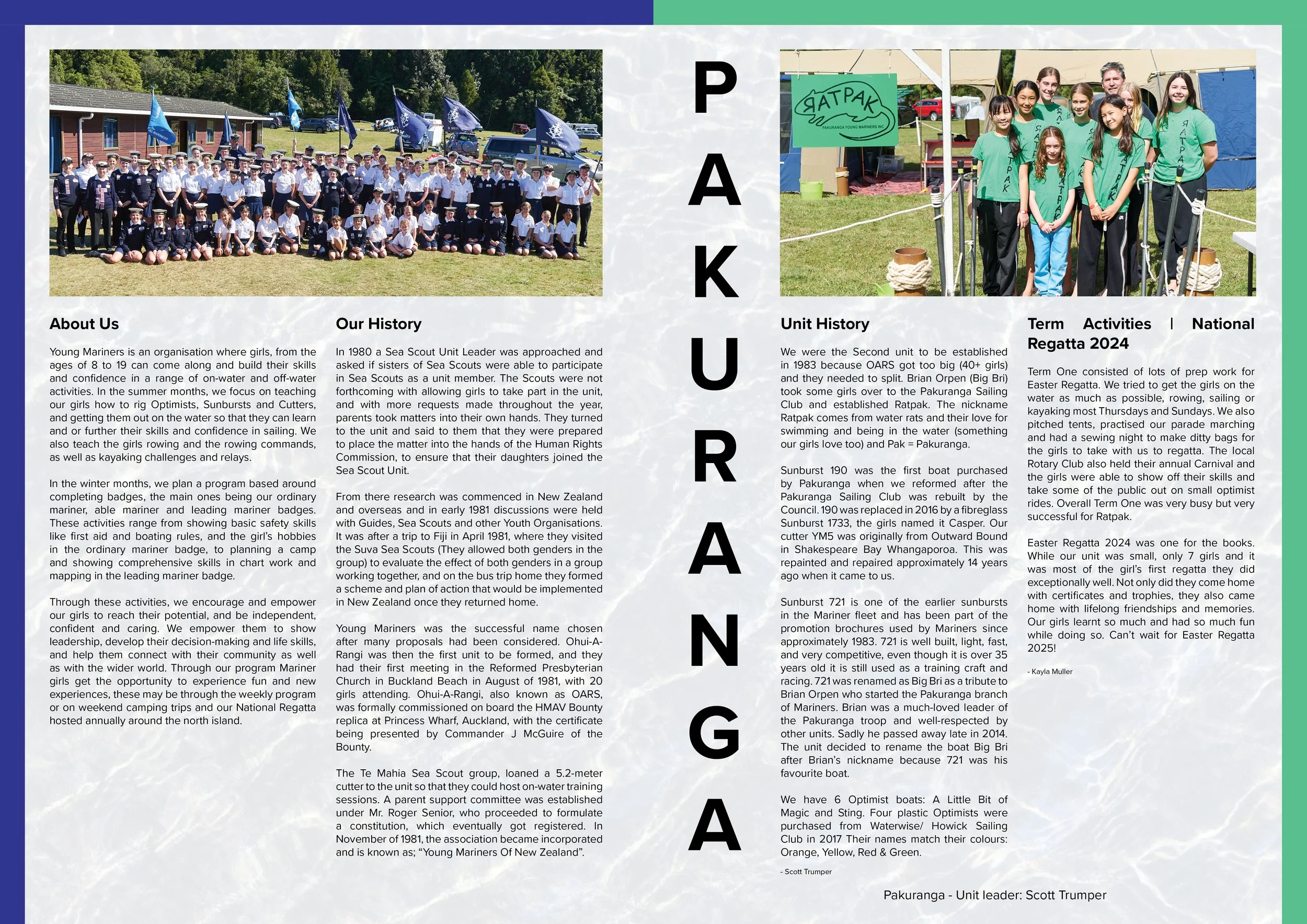
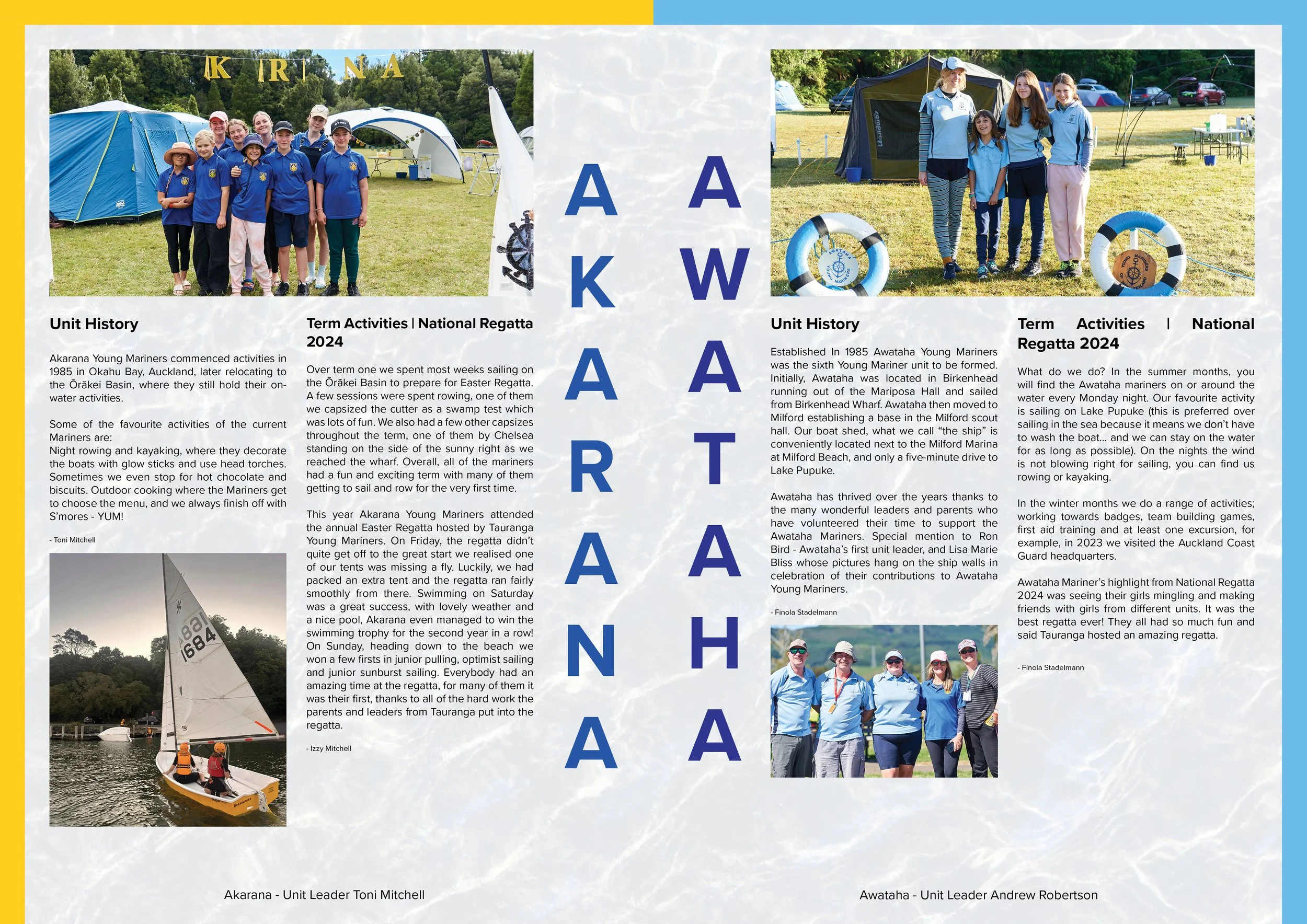
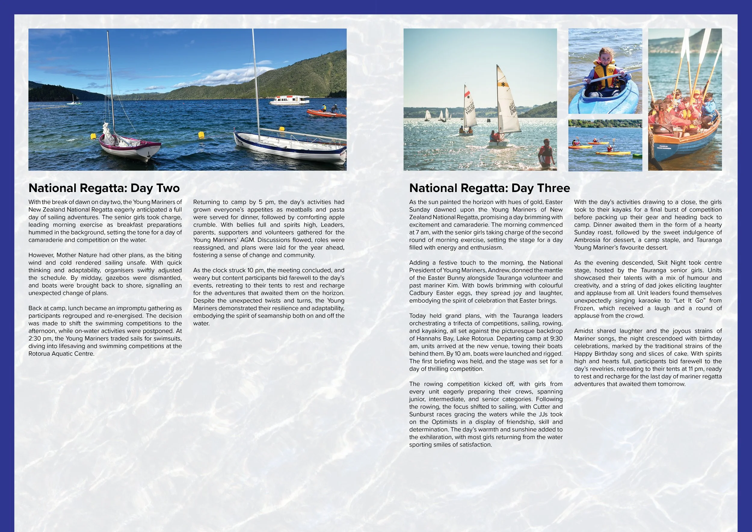
Young Mariners Of New Zealand
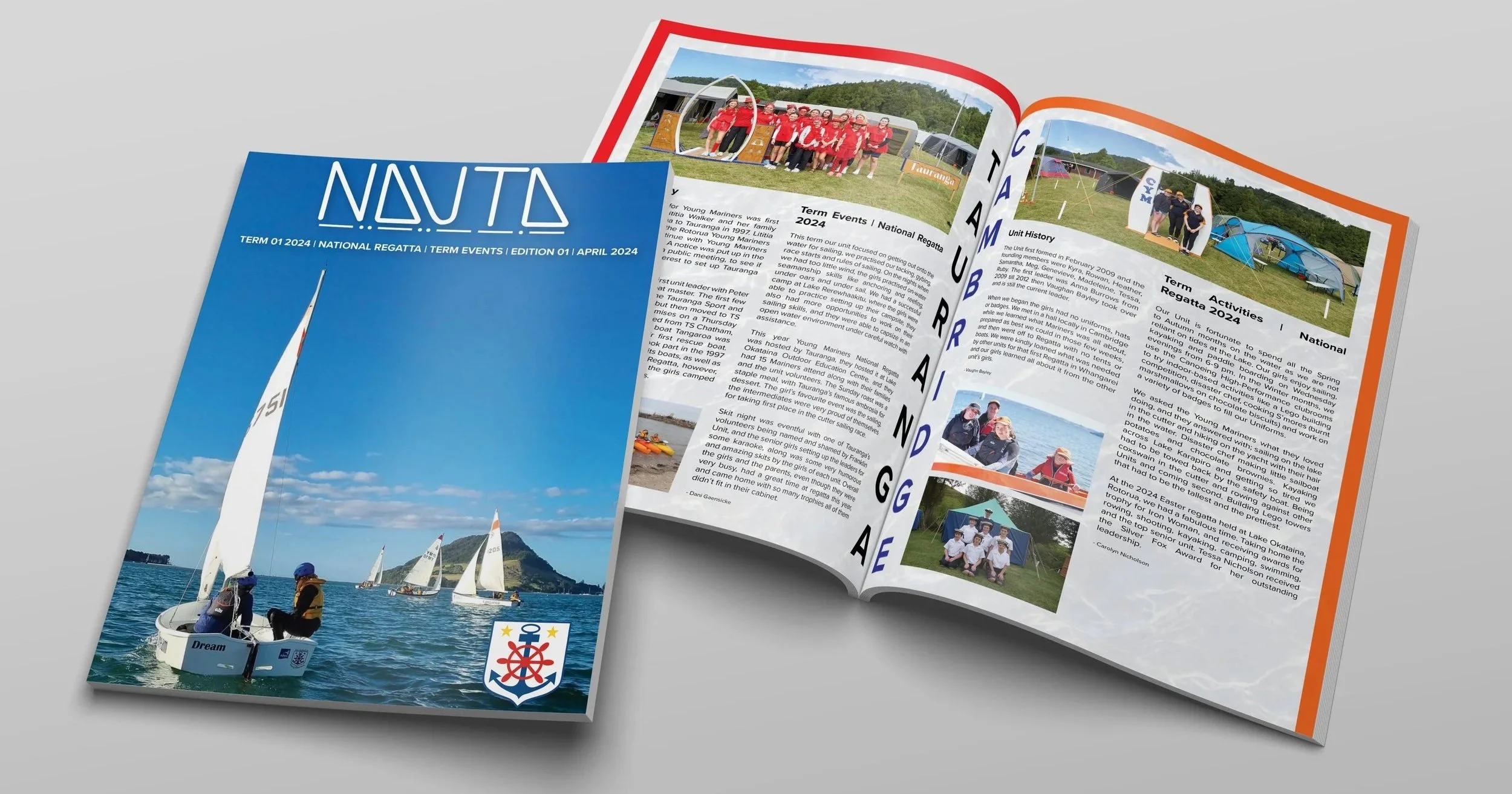
Nauta is also a good learning tool for the girls as they are encouraged to write articles for the magazine about their experiences each term. The back page also features an activities section, where the girls can further develop their theory knowledge ready to put it into practice in our summer terms. Nauta as a whole provides families, volunteers and newcomers with the history of Young Mariners, and how our organisation has grown, as well as information about what we do, and how young girls can build their on-water skills and confidence.
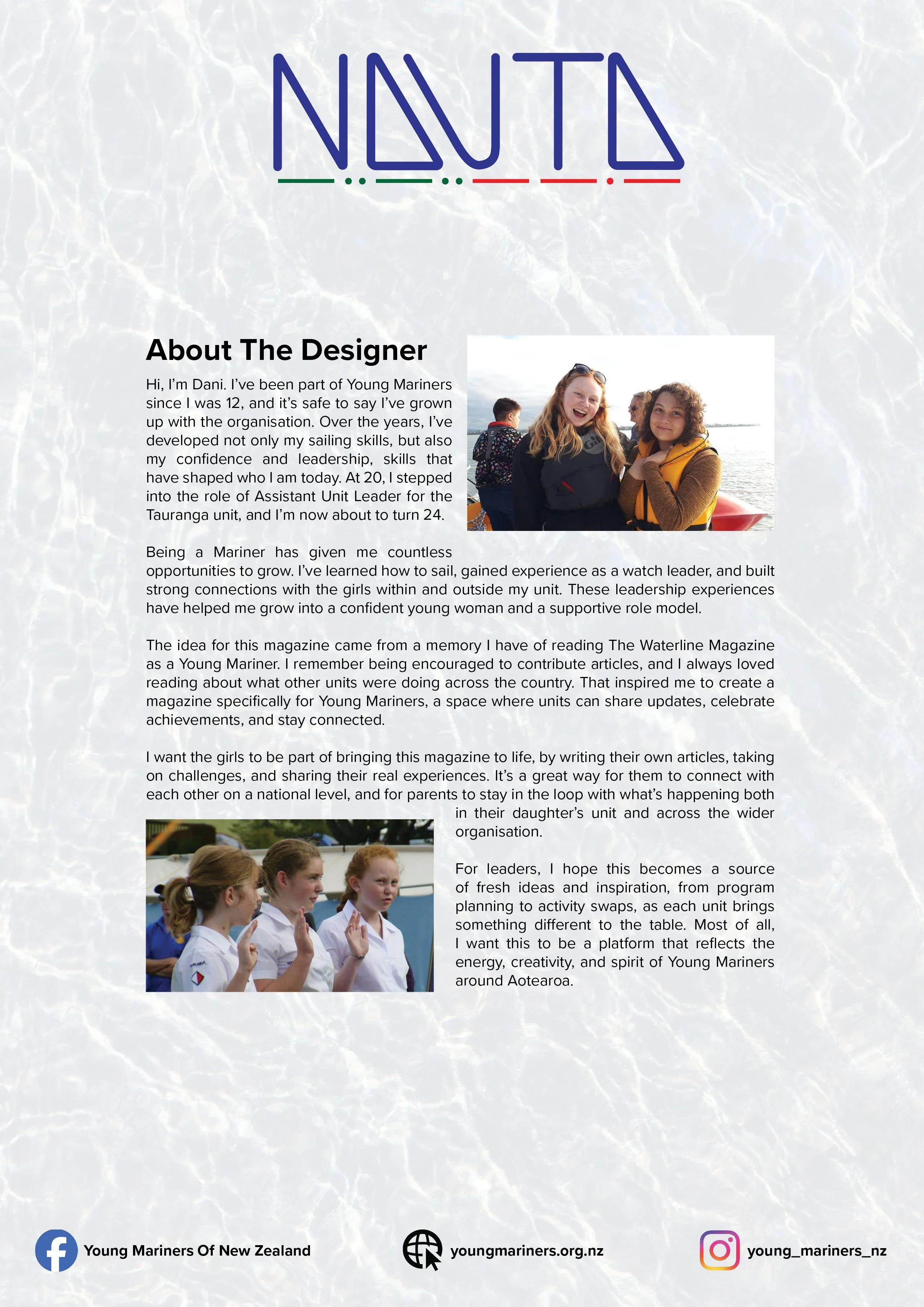
Nauta is a magazine about an Organisation called Young Mariners, I grew up in Mariners and now volunteer for them as an assistant unit leader for my unit, Tauranga. I created the magazine as a way for the families of the girls who attend, to see what activities and learning the girls do when attending a Mariners session. The magazine is also a good way for leaders and volunteers to see what activities other units do during our terms so that we can discover new ideas for our term plans each year.
Logo Iteration

Above are a series of images showing the development process of the Nauta logo. The design began with initial hand-drawn sketches to explore ideas and shapes, which then evolved into digital iterations where I refined the form and introduced colour.
The final vector version was simplified following feedback, removing the vertical Nauta element and adjusting the Morse code colouring for better clarity and balance.
A black and white version was also developed to ensure the logo remains versatile and effective across all backgrounds and applications.
Nauta is derived from the Latin word for “sailor,” chosen as a fitting name for a magazine celebrating the Young Mariners community. It reflects adventure, freedom, exploration and navigation, important values within the maritime world and Young Mariners.
The logo is a custom wordmark where the two ‘A’s are shaped to resemble sails, a visual element to represent what the magazine and Young Mariners is about. The colour palette draws inspiration from nautical traditions, navy blue represents sailors and the Young Mariners uniform, bright red signifies port, and green symbolises starboard, directly referencing maritime navigation.
Along the base of the wordmark, a sequence of dots and dashes spells out NAUTA in Morse code, a direct reference to the historic ship-to-ship communication. Together, these elements create a logo that reflects the values and activities that defines Young Mariners.
Final Outcome